Closed community
Keep the audience specific so communication can be more relevant than a public feed.
An older school social app concept. I’m keeping it in the portfolio with the useful part included now: what I’d change if I built it again.
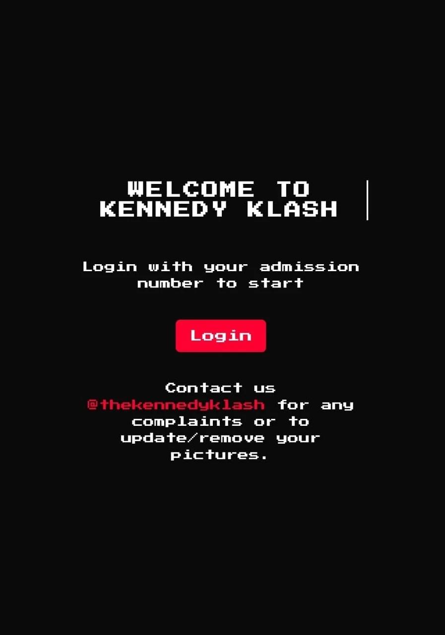
Create a more focused digital space for students and faculty instead of relying on a generic public social network for school communication.
A school-only social app with institution-based access. The login used an admission number so membership in the school was part of the product logic, not just a profile field.
Keep the audience specific so communication can be more relevant than a public feed.
Interface design, early user thinking, project coordination and stakeholder communication.
This was an early portfolio project. There are no production metrics and I’m not pretending there are.
I’d stop treating “school social network” as the product. That is too broad. I’d start with high-frequency utility like notices, clubs, events, timetable changes and direct school communication. If a social layer earns its way in later, fine.
A narrow audience does not automatically mean a clear product. You still need a sharp job to be done. “For students” is a user group. It is not a reason to open the app.
Grounding access in the institution was the right instinct. The better version would just be much more ruthless about what happens after login.